
Holiday Inn Business Traveler for iOS
This app aimed to allow business travelers an effective way to communicate while traveling in groups or alone. I made the research and interaction patterns for this app.
Our Team was a highly independent and self-motivated group of designers. This allowed me to focus primarily on Research and Interaction design.

Research
User Interviews
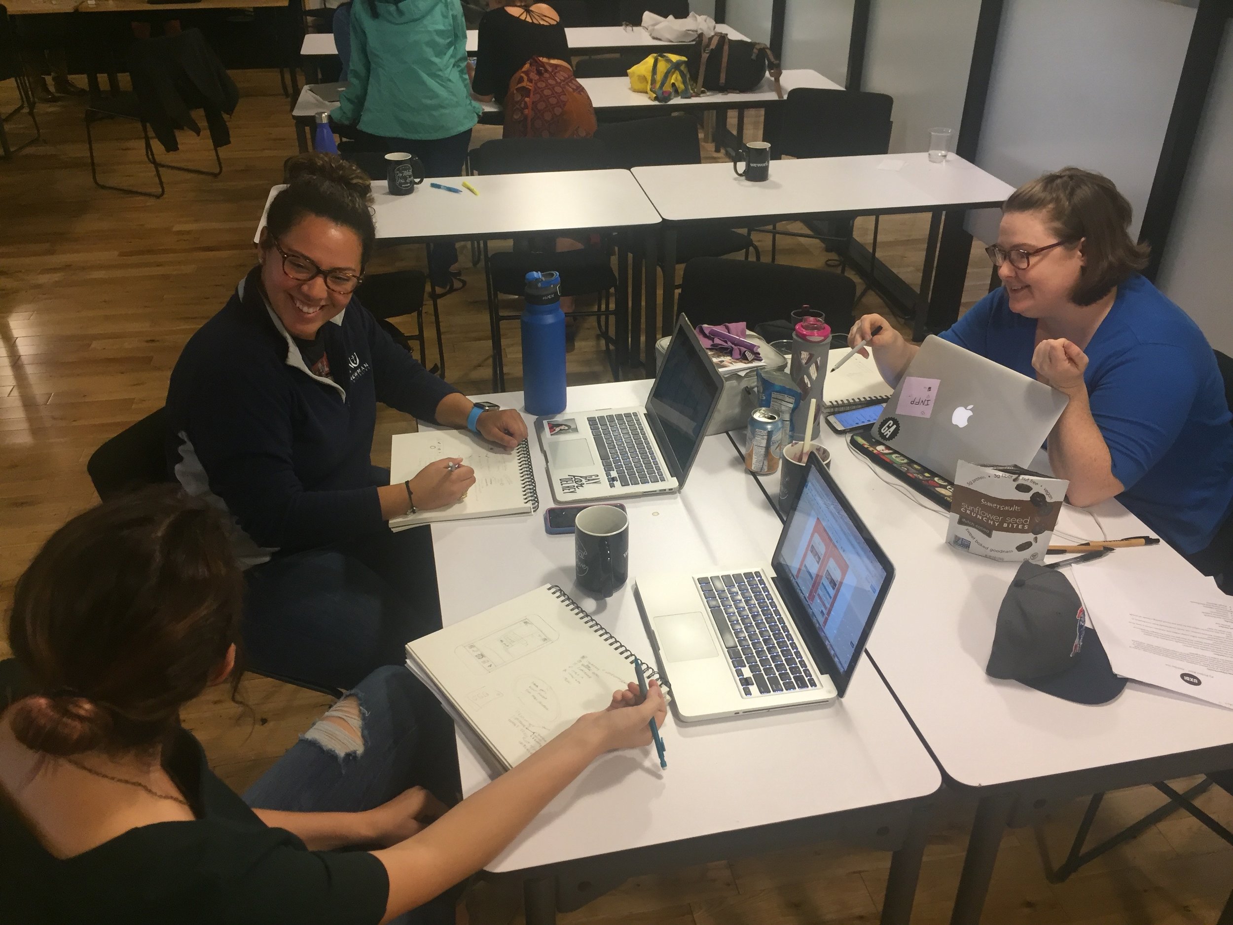
I created the questionnaire that our design team used to conduct interviews.
I spoke with five business travelers who gave us insight into what they have experienced when traveling for business.
Above are a few of the answers from user interviews that influenced our design the most.
Surveys
While recruiting for user interviews, I had some issues finding users that traveled for business in groups. However, I built momentum by finding people to interview with survey results.
I created the questions for the survey as well. This allows us to see if there was a demand for a group travel app or if single business travelers needed to be addressed more. I found the trend towards single business travelers who often meet up with colleagues when they arrive but mostly travel on their own.
Personas
I created these personas based on user interviews, the information I collected from the surveys, and external research.
These personas guided the direction of the project.

Planning & Design
User Journey
After I had brought all of our research together, I created the user journey with input from my teammates. I combined the Personas, Scenarios, and User Flow to create the User Journey.
This User Journey maps out the primary user paths we focused on building out for this project.

Delay Notification
This interaction pattern came out of user research; one of the interviewees told me a story about one time he couldn't reach the hotel while flying to let them know of a delay, and his room was sold to someone else.
This fit with our Persona, Greg. He is looking for new ways to communicate more efficiently using technology.
This provides easy access to contact the hotel, letting them know you are: running late, want to cancel your reservation or give them a call.
This button is most easily accessible on the screen's lower right-hand side, allowing user freedom.
Icon Iteration
The button icons for the main navigation bar were not all the same design and didn't express their functionality as well as they could.
I decided to change the three middle icons and keep the other two as they all fit the flat design we had agreed on. Go back to nounproject.com found these options, which the design and made function more apparent.


Testing
Usability Testing
Three different formats I tested with:
Online prototyping with Invision and Zoom
In-person with the Invision app(pictured here)
In-person with the Invision website
The best results were with in-person testing using the InVision app. The users used the app more naturally and seemed to relate to the scenarios easier this way too.
The language for the Notify Hotel button should be changed to Contact Hotel, as users were confused by the wording.
Usability In Person test with the InVision app
“This would be a very useful app for travel. It’s so simple and easy to use.”
Wrapping up
Future Iterations:
A few of the features I would like to add to this design later include an interface to find Public Transportation, to build out Request a Service, and the Past Stays options. These features would help round out the app’s experience for users.