
Blanton Museum Giftshop Website
Created an online checkout and item browsing; I worked with information architecture, user research, and interaction design. Balsamiq was used to create wireframes and the user journey.

Concept sketches of the search and checkout pages.
Vision
Create a site for first-time users. While still allowing the more advanced users to explore the store.
Convey the sense of bringing culture home as the museum Giftshop does.
Bring more revenue to the museum to aid expansion and new exhibits.
The user should be able to Buy, Search, & Checkout.

Research
User Research
User Interviews show that museum-goers focus on supporting the museum for its culture. Therefore, they want to buy unique items from the museum's store towards this goal.
The Blanton also has active Facebook and Pinterest accounts. Researching these pages showed what museum-goers were interested in and who was buying. Pinterest's page provides specifics about the kinds of items that are popular. Facebook lets me see comments and general data about the museum goes.
Card Sorting
The participant of the card sort found the grouping titles to make sense and only wanted to put perfume into jewelry and apparel. So I add this item to both lists.

Persona
Nancy, my primary persona, needs a specific site with no complicated steps. She needs to have all the information readily found and understood.
Also, I kept my secondary persona Samantha in mind to provide some balance. Samantha needs less guidance with online shopping and more flexibility.
Comparative analysis
Metrics for choosing which sites to compare: easy user experience, museum perspective, or a transparent checkout process.
These sites had different menu types, search options, and checkout processes.
From Wish.com, I got an idea for a straightforward checkout process. The Met Store gave me an idea about how to do the About page. REI and Zuilly give me ideas on how to display the product pages. Finally, Amazon inspired the rating system.
Sites Compared


Planning & Design
Sitemap
MindMeister was used to create this sitemap. You can see the bones of the site listed on the sitemap.
User Journey
This user journey gave me a deeper understanding of what Nancy might have issues with while checking out. She seems to have the most problems with the checkout process. This is because she was so focused heavily on this flow.
Balsamiq is used to create the User Journey based on the scenarios.
Sketching & Wireframing
At this point, I create a few sketches for the new site. I was getting a basic idea of the layout and location where each feature should be. Drawing where simple to iterate with, but there was a limitation on how much I could explore. Once I was ready to look at more details, I moved to wireframing.
You can see that I put a lot of thought into how Nancy would reach each page. However, the process remained straightforward and clear as she moved through checkout. Each step shows her what she has done and what she is about to do.
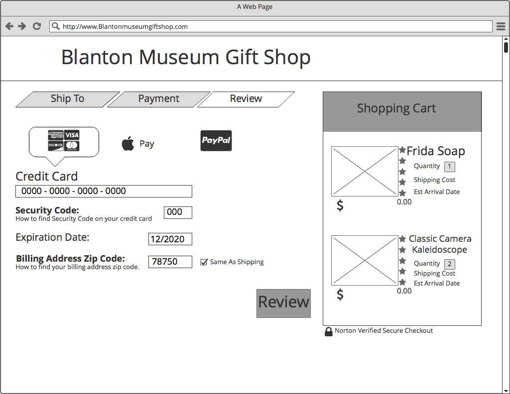
Wireframing in Balsamiq

Testing
Usability Testing
Went created my testing materials, I included a screener survey to find participants who were familiar with online shopping, along with a user testing script.
I did usability testing with four different users. Both online and in person with the InVision prototype website.
The issues users noticed didn't impede their usage of the site. I used their remarks to create solutions, as you can see in the link.
Wrapping up
Iterations that made the site more user-friendly were; when, after user testing, I made the header cleaner— worked on adding a secondary search option in the global navigation and l so, making the footer easier to navigate.
Future Iterations:
The next step will be displaying items pulled by the search engine.